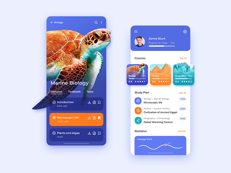
Mobile App Concept: Education
➡️ Visit our website to see more our works!
Research shows that people make subconscious judgments about a product within 90 seconds of initially viewing it, and 62% to 90% of those assessments are based on color alone.
Choosing the right color for a product interface is a challenge. We use all possible ranges of techniques from studying the psychological influence of colors to analyzing research on colors in cultures to doing 5-second tests with usabilityhub.com.
However, we’ve found that it's impossible to utilize testing platforms that measure emotional feedback on an interface when it comes to apps for kids and teens. The age range is limited to 18 to 100 years old, leaving no opportunity to attract a younger audience for testing.
How do you validate your design decisions, and have you ever tested user behavior in apps for teens? If so, how did you do that?
