Day 24 - Geared Up
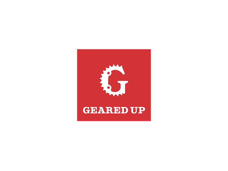
This is a logo for a Bike Shop called "Geared Up" for the 30-day logo challenge.
For this one I went through a lot of designs I wasn't happy with, initially trying to go down the road of a crest or badge for the shop created from bike components, however, after looking at the actual gear of the bike next to the "G" I realised I could combine those into a really effective letter mark.
After that, I went through a lot of combinations of font and colour as I wanted something strong and classic looking but tied in with the simplicity of the letter mark I'd come up with so I went with a Slab Serif font on a red field as I could see that look really well on the sign outside a shop.
More by Finbar View profile
Like
