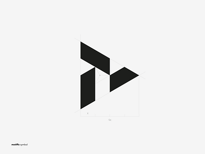
Symbol for Motiffo brand agency.
I've just designed a logo symbol for a rebranding agency Motiffo. It's a variation of the letter M since that's an initial letter of the agency's name. I've decided to base the symbol on a triangle using geometrical shapes built into asymetrical form. The way all the elements are used is not coincidental - I believe that if you look carefully you'll be abe to see a shape resambling a head of a phoenix which for me is the perfect metaphor for rebranding.
More by Michał Mleczak View profile
Like
