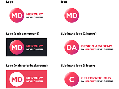
Mercury Logo Design Contest
An attempt to refresh the current Mercury logo, but keep it familiar.
Having an abbreviation of the company name inside the icon allows:
1) adapting the icon to a sub-brand simply by changing the abbreviation. This creates a strong connection between the company and a sub-brand, represents that the sub-brand belongs to "planet Mercury".
2) keeping the company colors on the icon regardless of the background - either the planet or the abbreviation could feature the company colors.
3) making the icon more self-explanatory if it needs to be used without the company name alongside it.
Like

