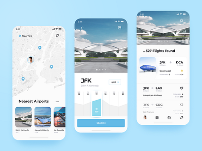
Flight Booking App
Our latest design concept is about simplifying the whole flight booking experience. If you’ve ever wanted to build an app like this one (or if you’re a frequent traveler), you should definitely check this out! ✈️ It’s more than just time-saving. Once the user gets a boarding pass, s/he just scans the barcode on the screen at airport security checkpoints and at the gate during boarding. Using just the app. So, yes, it’s not just time-saving - it’s also easy and paper-saving.
💬 We planed to focus the user primarily on flight information and make the experience more comfortable to explore. To achieve it, we used the power of space and font weights. Press 👍 if you like it and say What is the thing you hate the most about booking apps? Booking cars, flights, hotel rooms - whatever.
Created by Ilya Utkin
The team is available for new projects! Drop us a line: hello@purrweb.com | WhatsApp
PS We know to utilize UI/UX design to make users fall in love with a product. Check out how we used our skills to: - raise $400k as capital for startup - streamline cryptocurrency e-wallet - reboot a Real Estate startup - help newbies jump into investing - conquer the chef freelance market - simplify the life of event organizers And that's not all — you can find more case studies in our Blog! 💜
Join us on: Website | Instagram | Medium | Behance | Facebook


