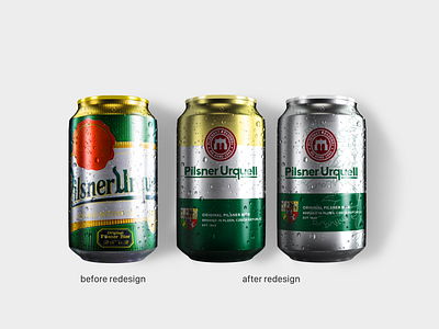
Pilsner Urquell Can redesign | 3/3
We redesigned logo and packaging for one of the most popular beer brands in Europe.
The main focus was to keep the old feel of the brand, with the hint of new fresh air.
We decided to just clean up the logo a little bit, keep the mark and the color scheme that is unique for the brand.
We also redesigned bottles and cans for the beer. So the shelf presence is better, and the packaging is not so cluttered.
We created two packages, one that is true to the original and one, that is quite different and introduces one more element to the packaging, that is the Czech Lion. That also shows the heritage and origin of the beer and brewery.
To see the creation process check out our youtube channel:
https://youtu.be/Hjc0I1K9UFQ
More by Epsilon View profile
Like
