Simple Conversation (v2)
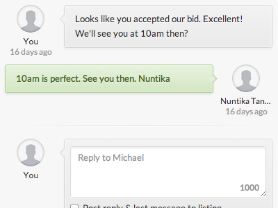
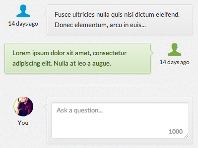
Decided to ditch the icons and go with a consistent avatar look (with default, using helveticons). We'll be using gravatar so it can't use a web font default without a bit of thought (which wouldn't be worth the time). It's going against the grain of iOS coloring and layout but I think it needs to be more obvious what's been sent to you. If viewed by the "other side" of the conversation, the colors and layout are flipped.
More by Sam Potts View profile
Like

