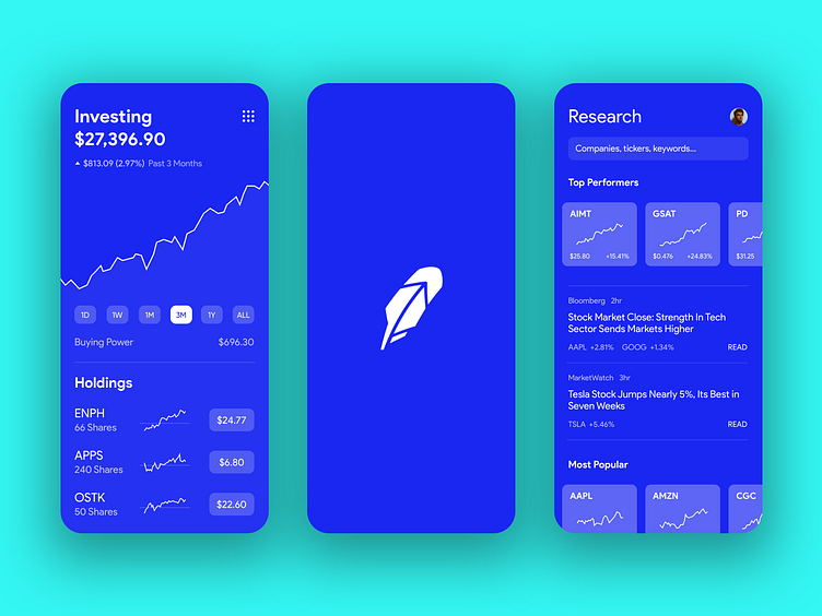
Robinhood – Blue Redesign
Robinhood has one of the best user interfaces out there right now, so for a little challenge, I wanted to attempt a redesign concept.
Obviously, the biggest change is the deep blue replacing the white and mint-green. I changed some structural stuff and elements too, and also used a new font.
And this entire design only uses two colors, #FFFFFF and #1A27F1.
Please leave feedback, positive and negative!
More by Kyle Collins View profile
Like
