Daily UI #039 - Testimonial
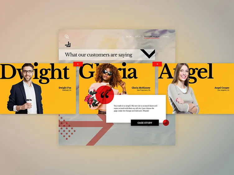
Thoughts I had fun with today’s challenge and went with a more experimental layout. I also wanted to try to work with dynamic typography within Figma. My goal was to mimic the style of magazine covers while retaining UI functionality.
This layout would act like a carousel with the controls being the small red buttons on the rails of the “screen”. The User could then click on the [case study] button to learn more about the customer’s experience. I would love to animate this layout using Principal, but I have yet to get my hands on the product.
Overall, I was pleased with the result of this challenge. I am looking forward to the next one!
-- -- --
Press L if you like my shot, and follow me if you want to keep track of my progress on the Daily Challenges! See you at 100. 😋👍
The challenge is to complete one unique User Interface design task every day, for 100 business days. You can read more about it here: https://www.dailyui.co/
