Unbounce Logo Redesign
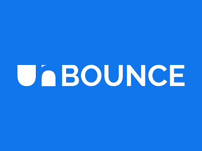
This is my vision for the new Unbouce (unbounce.com) logo. It's simple, clean, elegant, and memorable.
Font used is Raleway. I took the U and simply capped off the top. Then, I used that U to make the lower case n. I used a serif version of a lowercase n to give the illusion of an n with whitespace.
Hope you like my concept, press L to show your appreciation of my work - it means a lot to me. Thank you!
