Wraparound Drop Down Menus 2
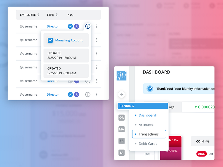
A few more examples of the wraparound drop down menus we did for a banking Wallet app.
We tried something different with the navigation menu for this project. Before I switched to Mac about 8-9 years ago I was on Windows, and I used Outlook Express for email for 10 years. I check my email about 20-30 times per day. Even though I was on it for 10 years, I couldn't tell you what the icons looked like for Inbox, Sent, etc. Because I read the words. People look for the path of least resistance and reading is far quicker than try to discern what an icon represents if it's not ubiquitous.
So for this project we used the first 2 letters of the navigation entry when the sidebar is collapsed. When you hover over the rest of the letters fill in. So MA would be Marketing and BR would be Brokerage.
Thought I would mention that. We did however create icons as a backup plan for them.
For more UX + UI Design go to https://www.theskinsfactory.com/uxuidesign
