Behind the Design: Cityblock Colors
I'm going to try something kind of new here—posting shots unadorned, unaugmented, "unpolished", exactly as they exist for me and my team in real life.
The focus here will be on the thought that went into the design, rather than just the visuals—there's a lot of thinking that images alone can't communicate!
✦
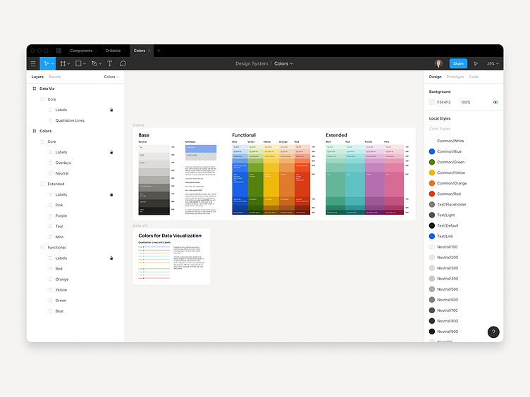
Over the past 6 months, we've been refining the design system for Cityblock, including the color palette we use in-product.
We wanted a system that was flexible enough to accommodate many different applications, but one that presented a consistent brand image—and could be easily and consistently applied.
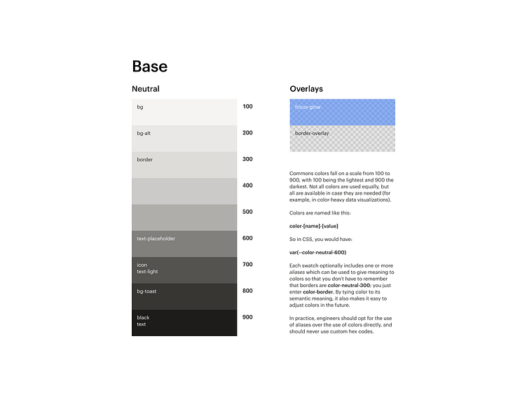
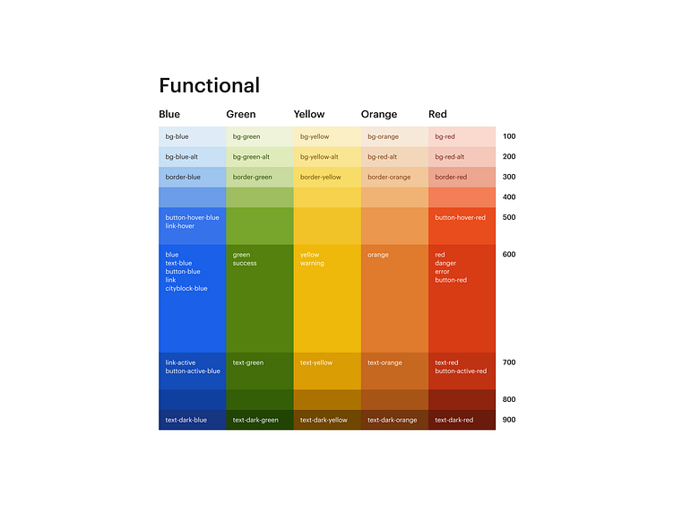
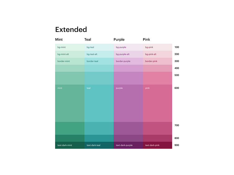
We ended with a fairly large palette—90 swatches plus 2 semitransparent overlays—but it's organized into categories and labeled by use. Base, "neutral" colors are used most often, followed by functional colors. An extended palette is available for things like data visualization which require extra nuance.
Most colors get an alias like text-dark-blue to aid proper use, and all color combinations were tested to ensure AAA contrast for maximum accessibility.
✦
In selecting our overall palette, we drew inspiration from real life.
From our design systems doc...
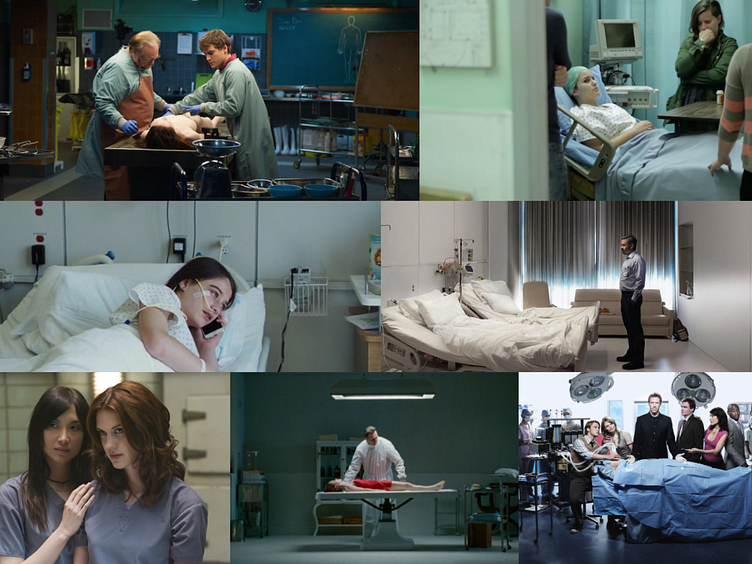
Consider the way two settings are portrayed in film. Pay special attention to their use of color.
First: the hospital.
The scenes here are cold. Sad. Notice the strong use of blues and cool greens. Stark whites. Dark blacks. Rarely, in a hospital, do we see the warmer end of the spectrum—and often when we do, as in the bottom left image, it is to portray a certain grungy decrepitude. These blue-greens are distinctly clinical (down to the robes worn by patients and doctors), and they feel off-putting—if only because films like these have taught us that they *should* be off-putting.
Consider the texture and lighting here, as well, and how they metaphorically extend to a digital interface: is Commons fluorescent-lit? What textures is it composed of? Hard steel? Concrete? If it had a smell, what would that be? (Hopefully not latex gloves and anesthetic.)
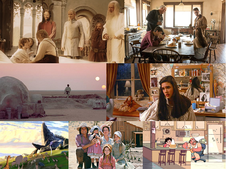
Now, consider how film portrays “home”.
Look at the difference! “Home” tones are warm—even the blues and greens (as in The Lion King, bottom left) take on yellow-orange hues. Everything appears soft and golden; Frodo’s sheets are practically glowing. Textures are natural. Sunlight. Stone. Lots of wood. Few synthetic things.
Does this mean that everything in Commons needs to be golden-beige? That we need to immediately scrap Cityblock cobalt blue? No.
What this frame of mind offers us is a point of view. Colors should be chosen to serve the needs of our care teams and our members, and align our brand to our goals. Cityblock should feel less like the hospital, and more like home.
✦
Researchers hypothesize that blue light exposure suppresses melatonin. Many products tint their grays blue. At Cityblock, we've opted for the opposite approach, tinting our app warm with the hope that it'll make our care teams and our members feel more at-ease.
How do you use colors in your product? Are they identical to brand colors or do they differ? Are the differences intentional? How do you think about applying color to large areas versus small ones? If your app was constructed of physical textures, what would they be?