Barrett Housen Branding
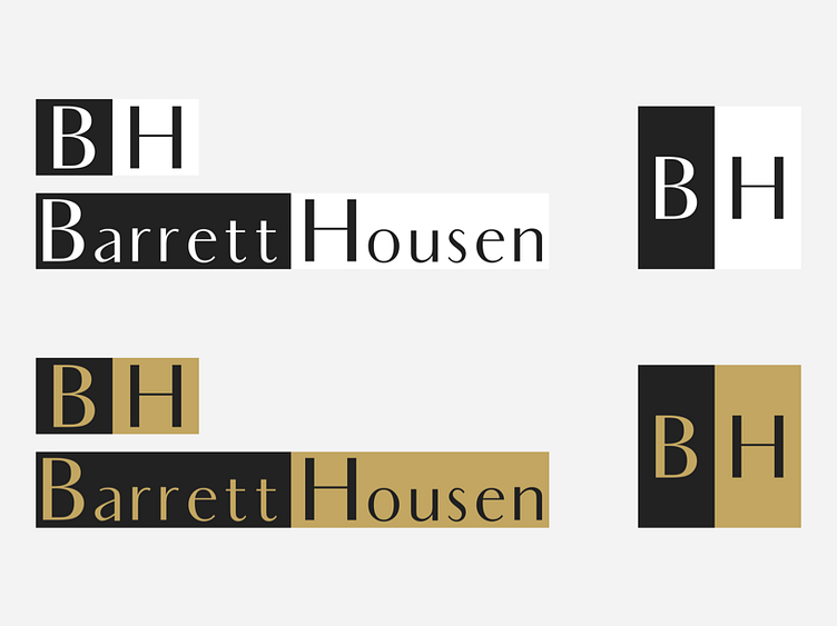
Barret Housen approached me about doing some branding work. They came with colors (i.e. the gold and grey) and gave direction on what they were looking for (luxury, simple, type-focused). We went through 3 or 4 different versions but eventually landed on these concepts for the logo based off of the Audrey typeface.
Out of the box, Audrey needed a lot of kearning to work as a logo. However, I like the end result and BH is happy.
