Identity Sign of a Product Designer Patryk Kopeć
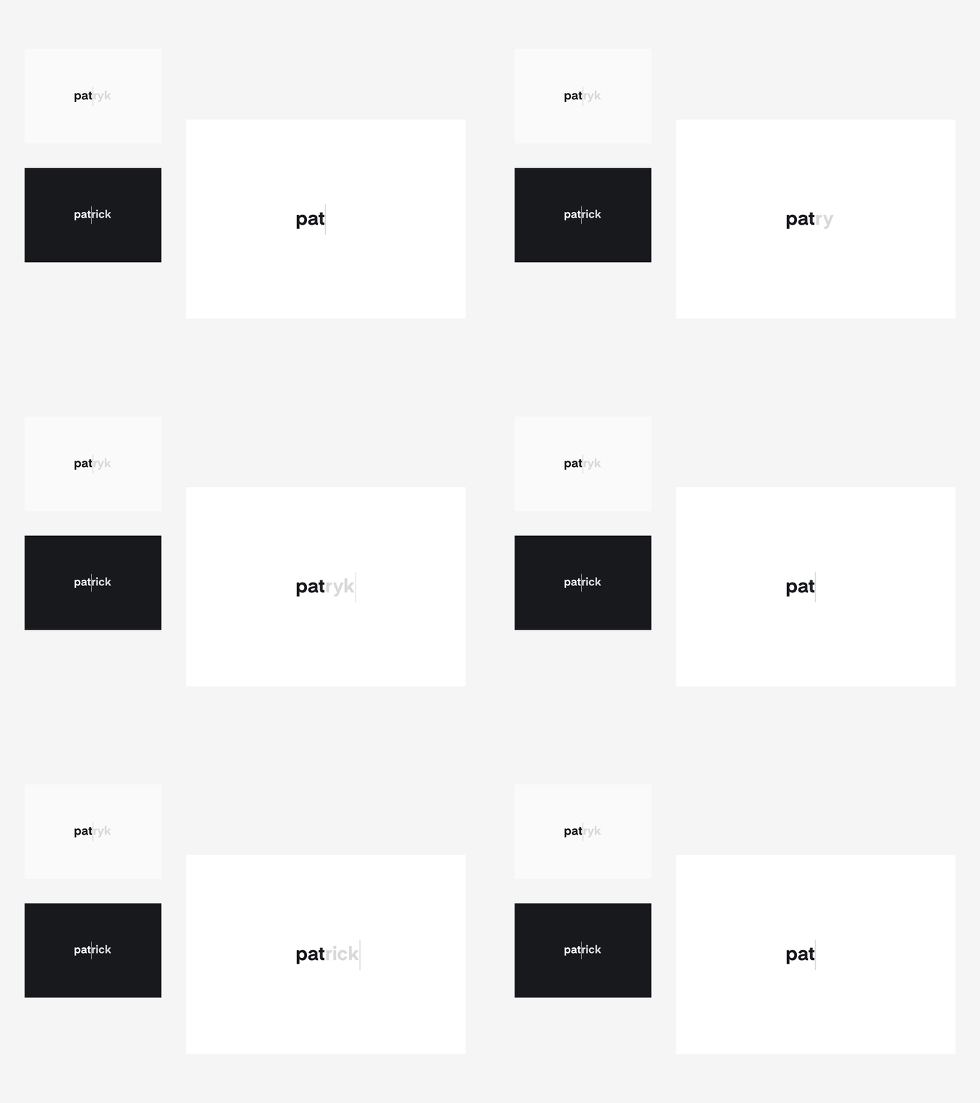
I decided to design my Identity Sign in two language versions:
🇵🇱 Polish 🇺🇸 English
By creating a logo in two language versions, I wanted to show my activity on the Polish and American market. I divided a logo into two parts, which were distinguished by two colors, i.e. black and gray, and a vertical line placed in the middle. The first black part is constant. The second gray part is changing.
To illustrate this well, I designed a short and simple animation combining both signs 🙌
—
👉 Don’t forget to take a look at Live Website
More by Patryk Kopeć View profile
Like
