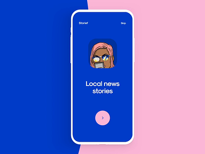
Finance App Onboarding Screens
Hey all, Traditional e-wallet apps are all about managing finances, right? We believe that the best e-wallet app ever is one that helps users manage finances + keeps them engaged. Here’s what we’ve done to achieve the balance between ‘Functional’ and ‘Engaging’: 📍 Benefit-focused onboarding is what helps to ‘sell’ an app within first 10 seconds. For that, we’ve picked main benefits that have the most impact on targets. 🗣 Each screen breaks down the most important value points for the user. 💬 Brevity makes the message more impactful. To achieve this, we needed to make sure that all the benefits were clear and to the point. Press 👍if you liked it and let us know How often do you experience the onboarding flow, without searching for the ‘skip’ button?
Created by Anastasia Martyan & Vadim Subbotin
The team is available for new projects! Drop us a line: hello@purrweb.com | WhatsApp
PS We know to utilize UI/UX design to make users fall in love with a product. Check out how we used our skills to: - raise $400k as capital for startup - streamline cryptocurrency e-wallet - reboot a Real Estate startup - help newbies jump into investing - conquer the chef freelance market - simplify the life of event organizers And that's not all — you can find more case studies in our Blog! 💜
Join us on: Website | Instagram | Medium | Behance | Facebook
