Puerto De Indias Gin Homepage Concept


Created just for fun. 📸
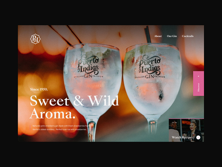
Last week I spent some time with Puerto De Indias photographing their strawberry gin. I was just along to photograph (something I do alongside web design) but caught a few shots I thought would work well on site due to the vibrant colours, ultra compressed bokeh from my 85mm lens and framing.
It also gave me chance to play around with a new font that I'm intending to use of a future (personal) project and experiment with a few layouts.
I've attached a version showing the layout with an alternative image from the shoot too!
Created just for fun. 📸
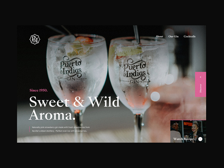
Last week I spent some time with Puerto De Indias photographing their strawberry gin. I was just along to photograph (something I do alongside web design) but caught a few shots I thought would work well on site due to the vibrant colours, ultra compressed bokeh from my 85mm lens and framing.
It also gave me chance to play around with a new font that I'm intending to use of a future (personal) project and experiment with a few layouts.
I've attached a version showing the layout with an alternative image from the shoot too!