Spotify Redesign [Part 2]
Hey guys! This was for the presentation I made to a R&D company that works with Spotify.
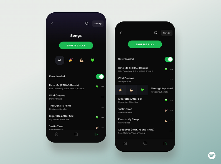
What are these screens? ----
👀I added a feature in which you could “swipe to add (or delete) into a pre-made playlist”.
💪🏻 I have only made 3 pre-made playlists (party, work out, favorites) but I think this could always change or more categories could be included.
✍🏻 According to my survey done on 120 people (this gives me a margin of error of about 10%), only 23.3% make a playlist often. The more than 60% of the rest say they do not make it often because it is tedious.
🗣 This swipe and add would not only make the process easier for the users, eventually increasing the creation of playlists but would also make the AI’s collaborative filtering significantly smarter.
👁 Also, you could easily visualize which song belongs to a particular category so the user has an easier time sorting through their library. (I have only made 1 category show per song but this would also probably change).
📚The wireframe of this app is in my instagram! [Instagram ID: joanne.jlee]
☑️copyright JoanneJieunLee Email: jl2366@cornell.edu Instagram: joanne.jlee
