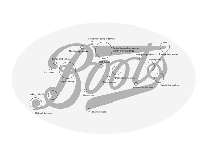
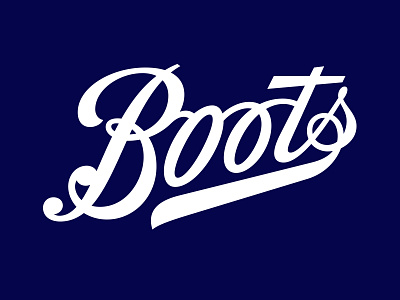
Boots Logo Assessment
The previous logo had many imperfections and the large cross stroke of the ‘t’ was too dominant and no longer necessary.
The crossbar of the /t originally held the word 'The' or 'Cash'.
More by Rob Clarke View profile
Like

