WePassengers, Menu
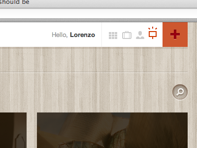
Despite I usually go for lights and shadows for more realistic results, this time I tried to use a really minimal and simple style for the menu bar icons.
Take a look at the whole project: http://wepassengers.com
More by Lorenzo Franchini View profile
Like

