Mercury Development Redesign

My proposal for the rebranding competition for Mercury Development.
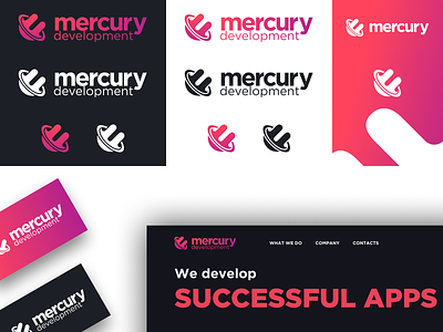
I reused Gotham for the logo's typeface as they use it already on places such as their site, creating consistency.
For the icon itself, the "M" is cut away from a circle, tying it in with the company, but also creates the image of a comet, representing the company's push for innovation, with them quickly adopting new technologies such as OS X and iOS, among others. The ring around the comet also represents the company continuously pushing the bleeding edge of technology.
The logo can appear solid pink, white or grey, or as a gradient, depending on the context.