Thursday Boot Company: Email Design Exercise
A design I did last summer as part of the interview process at Thursday Boot Company, an email promoting their Captain boot in brown. I was really happy with the way this one came out, especially the Dead Poet's Society influence. Just found it; thought I'd share it. Concept & copy mine; Images © Thursday Boot Company.
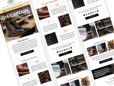
“Now in Brown” was the key driver behind this email, but a concern arose in that hinging a marketing message on color alone might rob the email of contextual potential. To that end, the idea was to seize (no pun intended) on brown as a color which envisions a sense of nostalgia (brown and sepia tones in old photos and books) and the rich shade of education (jackets, book bags, dress shoes + desks, wood paneled walls)…while pairing it with using “Captain” to evoke a reference to the classic film Dead Poet’s Society. As Thursday Boot made use of popular culture in past emails, this felt like an approach which would provide a platform to not only highlight the new color, but do it within a sense of depth and nuance hopefully recognizable to Thursday Boot’s target demographic.
The decision was made to retain Thursday Boot’s key fonts (Cheltenham and Avenir Next), both which fit the refined, cultured tone and theme as pulled from Dead Poet’s Society. Generous padding was created between modules/ components to allow the design to breathe, and the email was built at a breakpoint of 1200px but is eminently scalable to mobile viewports.