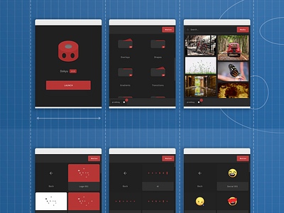
Dokyu Motion Blueprint
This portrait graphic was designed for an email campaign. The colour scheme is quite different from most of my Dokyu work but I wanted people to immediately think, 'design plan' when viewing it. I thought that the contrast might draw more attention to the app images as well.
More by David Hawkins View profile
Like
