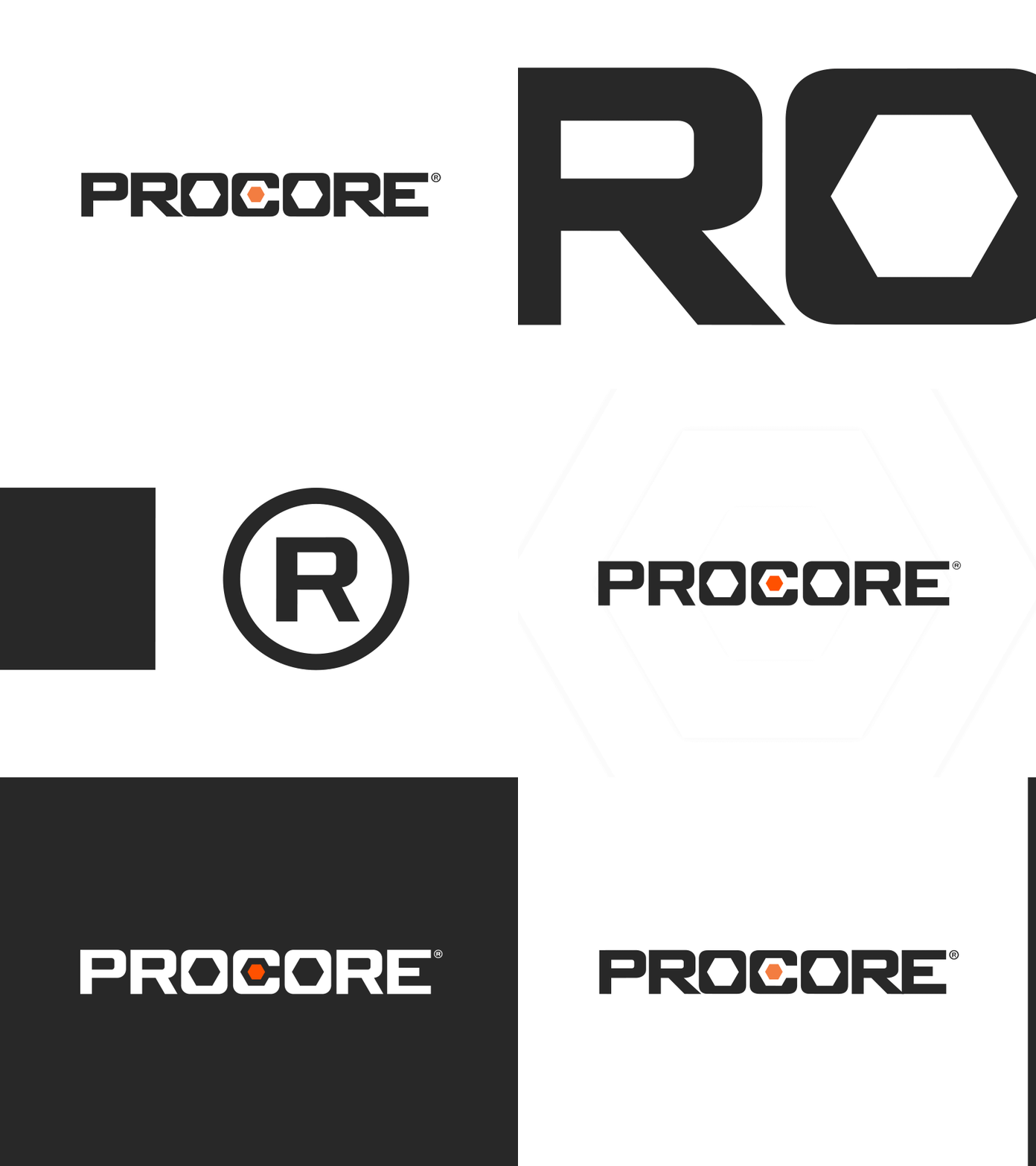
Procore’s Refined Logo
Introducing Procore’s Refined Logo.
Over the years our logo had developed a great deal of brand equity — however, there were a few imperfections in its construction. With our refined logo we’ve solved those imperfections to improve legibility without sacrificing our brand recognition.
With this refined logo we’ve: aligned the counters across all letters, made all corner radiuses consistent, center aligned the hexes inside the O ’s and C, created a consistent forward motion emphasized by the downward angles in the hexes in the O ’s and C and echoed by the legs in the R ’s, updated our brand orange to meet accessibility standards, thinned out the letters slightly to create more breathing room between letters especially at small scales, and we’ve used the new refined R in our trademark symbol. We did this while maintaining the same height and width of our old logo to make for a seem-less transition between the two.
Big thanks to the design team: Gregor Moulton, Heidi Ziskind, Ian Schechter, Jadyn Chen, Karen Owens, Tamara Weaver, Taylor Klundt, Andrew Antone and Tony Van Groningen.
