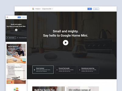
Home Mini Homepage Redesign
One of the companies I applied for tasked me to redesign the google home mini's homepage with the goal of generating more newsletter signups.
My approach was to sell the product first by showcasing its features as scannable as possible.
- I utilised a video of the product to generate interest as quick as possible and motivate them to scroll down more.
- I then showed overviews of the features to keep things organised but still accessible.
- Then the newsletter itself. The design is simple. Ample amount of space is given to attract attention. Since this is google's product, then I thought of selling google as purpose for them to signup. Hence the context + visuals used for this area.
I didn't get the job in the end... Tho I think I've learned a lot from this exercise :).
