Mobile Menu
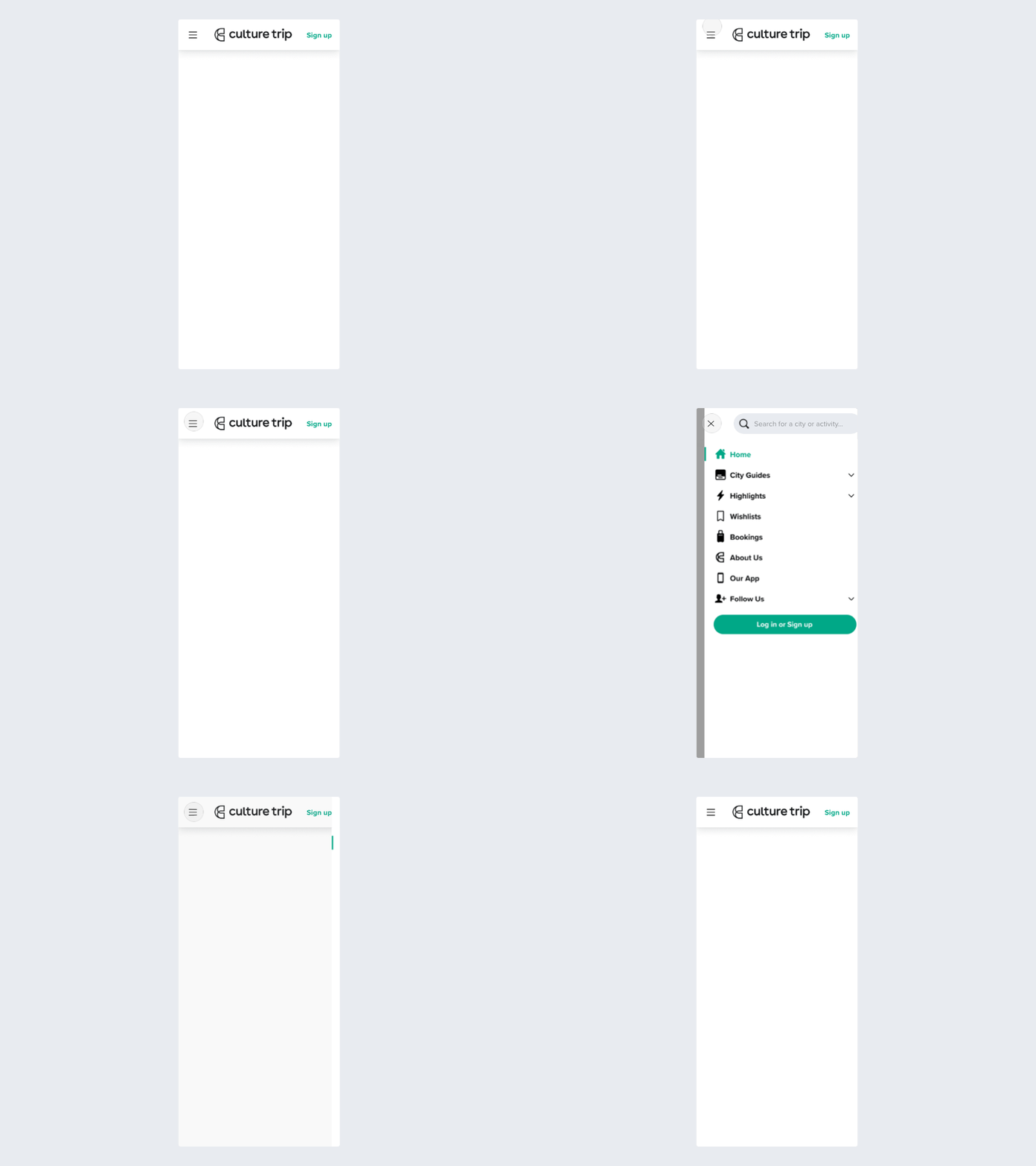
An unused concept for some small improvements to the mobile navigation on Culture Trip.
- I switched search into the menu and moved 'Sign up' in its place instead to potentially boost account signups by making it more visible. According to our analytics, search is used sparingly on mobile.
- Small icons sit besides the labels to better identify each element (placeholders icons)
More by Mike Stezycki View profile
Like
