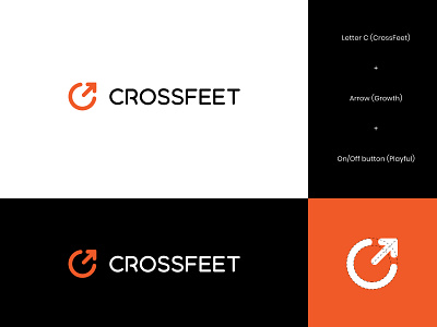
CrossFeet Logo Concept 2
One of the concepts presented for CrossFeet - playful and edgy socks company that is committed to both producing good quality and great-looking socks that allows athletes to perform at their best with an aesthetic kick.
The client wanted to avoid anything related to feet or socks, so we brainstormed other ideas.
This one is based on a letter C + arrow to represent the growth and improvement. Also, when rotated to the left for 45'', the logo also becomes on/off (play) button, which conveys the story and next possible tagline Game on.
Your thoughts? Appreciate your feedback :)
More by Insigniada - Branding Agency View profile
Like
