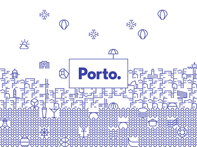
Porto
Just following the identity designed by local firm White Studio.
Inspired by the stories in the tiles ("azulejos" used in buildings or in private homes) they developed more than seventy geometric icons that represented the city and its people. The icons were designed based on a grid that could connect them with each other, creating a continuous network that evokes a tile panel. These icons became a visual code to represent the city. A code that can live by itself, viewing each symbol individually, or as a network of symbols that show the never-ending complexity of our city. Welcome to Porto!
More by Diogo Melo View profile
Like

