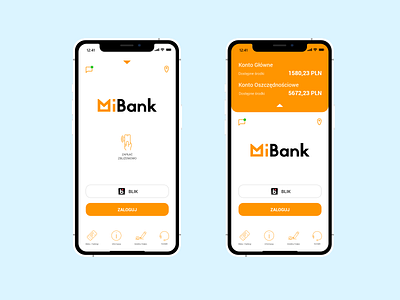
MiBank - banking app - 1/2 - login sceen
Hey there Dribblers!
If you haven't seen my previous project
https://dribbble.com/shots/6740756-Stream-App-Concept-Idea-Exploration
Before I jump into the shot I want to tell you - THIS IS NOT A COMERCIAL PROJECT - as before this one is to for me to learn how to build such thing from scratch.
---DESCRIPTION---
type: mobile bank account app - log in screen
os: ios
audience: various
fonts: Jaapokki, Roboto
---CHALLENGE---
based on build from Santander bank I wanted to refresh their layout and fit it more to the needs of a modern person. What I understand by that is to get rid of a unnecessary features and expose thouse that I find more appealing. While you cannot screenshot thouse type of app,s you do have to eyeball it most of the time.
---PROCESS---
First was the logo - fake bank need a logo - so I made one, this one is based on Jaapokki font sligtly changed in the corners and in hight adding more chubbyness to it. Than I made wires by copying the Santander layout.
There was 4 buttons at the beggining in the botton: "Offer", "Mobile Signature", "Info", "Contact". I hanged it by moving the "Tickets/parking/taxi" button to the place of "offer" button, with the last one gett rid of.
As you can see the notificationson on your latest transactions are on the left top corner, originally it was in a place of Wireless payment, witch I believe is second most important feature since most of a phones got this kind of technology in it, and as a studies shows - people more often changing their cards for wireless payment by phone.
By doing so I build new hierarchy for user action.
1. "Login" Button
2. "BLIK payment" button
3. "Wireless payment" button
4. "localization" and "notifications" buttons
5. fast navi bar buttons
Now there was a feature that I actually am fond of. An instant access to information about your bank account bill. This little arrow on top, you do this by swaping down, and neat bar shows up. I highlighted it more with bright basic color and I wanted it to be more connected to the "login" button, since I believe it is one of a most usefull things in this particular case. There is instant felling of knowing that if you want to know more about what's happening on your account, you have to login. And basic "orange" is the key to know that. But... you always can just see right a way how things are going.
All the icons was redesigned by me to fit more to this fake bank and to be more connected to things they represent. Yes, the navi bar has descripions, becouse I thinK that you just need them when your users are from range of 18+ to 99+. Sometimes you really have to tell them - that is not a shame.
Whoa... that was long!
If you are reading this
THANK YOU 3000
IF you like this
SHARE THE LOVE
and feel free to tell me what you think!
Cheers!
