Natural Home Brands Logo
While the Natural Home Products previous wordmark conveyed natural with the soft greens, it did not provide any recognizable logo. The right justification of all the text made no sense and forced the logo to be right justified on most product packaging.
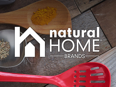
I redesigned the brand logo for my company creating a recognizable logo that integrates the "N" from natural and the "H" from home into a simplified home shape. I chose charcoal grey to invoke richness and relate back to the color of the kitchen tools. The wordmark is then simplified with "natural" in bold lowercase and "home" in light uppercase harking back to the original wordmark.
