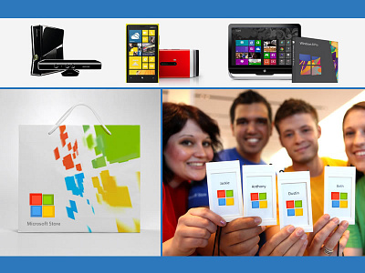
Microsoft | Logo Design Update
While some believe the company has a winner with the new logo design, others say it’s too boring. Some designers think the logo too simple, isn’t distinctive enough. It's too generic... It needs to be unusual enough to persist in the mind. Those four squares just sit there... no motion, no tension — it’s not dynamic in anyway. Did Microsoft missed a big opportunity to shine or this design is apart of a bigger whole. I to agree with some of these statements. So, I decided to add my two cents with a whole complete
update of Microsoft’s logo as well.
More by KEN WARE View profile
Like
