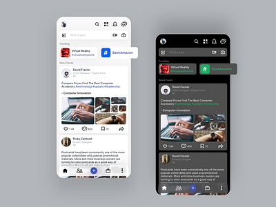
#1 - LinkedIn Redesign concept | On-Going UI/UX
Hello all,
Its always good to have options, so why sit with one shade when there can be another. Imagine our traditional linked-in in a dark shade.
LinkedIn is one of the most popular social networking platform, for which we took a step higher to design a new UI to replace the current one.
Latest trends are the ones that catch our eye. So we have brought it to the top where all u have to do is scroll right for more (just like tinder 😉 ). Why stop with the traditional like and share options when you can enhance it the way i have done. Wont you like my contents more when the like looks like mine?
most of them don't like it white and bright so i have chosen the dark mode to give it a subtle touch.
Stay tuned for the other features of LinkedIn
Follow us for more updates!
Dribbble Behance
LinkedIn
Facebook
Mallow Tech
