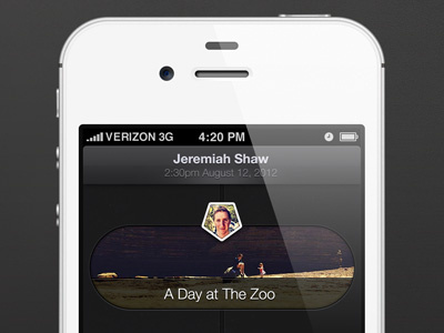
New Feed Concept
Just having some fun, and trying to break current conventions to come up with something fresh.
Some thoughts I had.
1. Change information in the top bar as the user scrolls. It creates a much more dynamic experience.
2. Create a new type of creation experience (see full size, 2nd iPhone mock). I had fun messing around with the tab bar sliding up from the bottom to reveal the creation functions.
3. Move away from the standard square and circle combination and try something unique, and weird. So, I used a hexagon, and "bubble" concept to create something a bit more futuristic, and fun.
Anyways, thanks for reading. Leave me a comment, and let me know what you think.
Thanks!
More by Charles Riccardi View profile
Like
