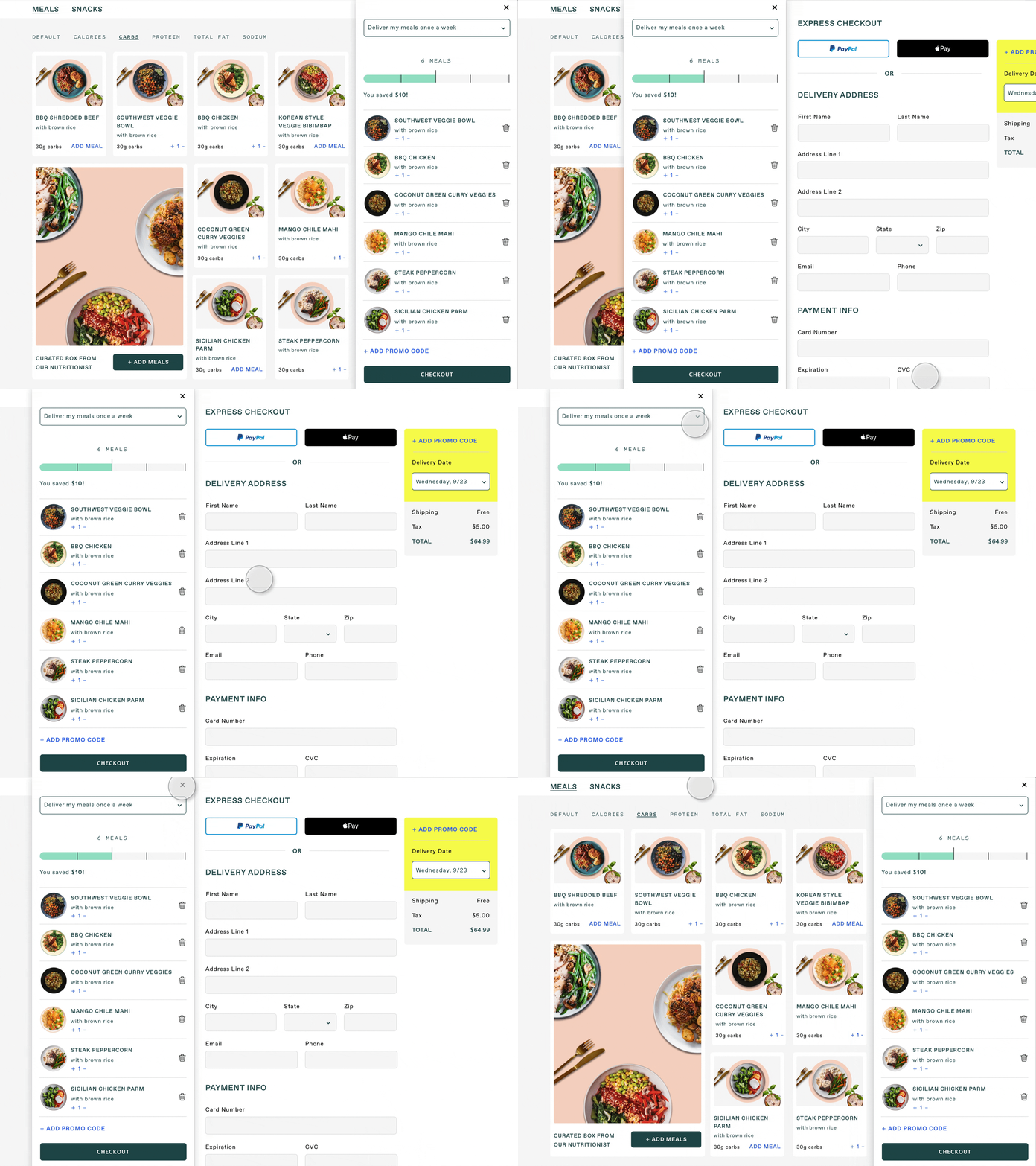
Shopping Cart Widget
We wanted to create an easy, simple and frictionless checkout experience. The physical space of the interface reflects the user’s mental model of sequential progression. like browse --> add to cart -->...to bridge the gap, when a user is ready to checkout - they don't ever have to leave the page - and checkout slides in from the right.
Hungry? Check out www.freshly.com and get healthy prepared meals delivered to your door!


