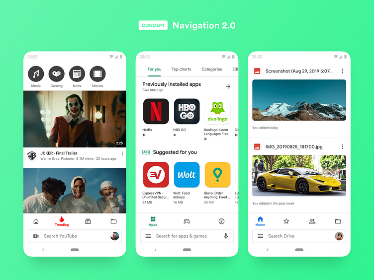
Android Navigation 2.0
With our screens getting taller, it is difficult to reach top navigation elements. Samsung had a great idea with OneUI to move all navigation at the bottom and leave the top just for information display.
Google recently introduced image swipe gesture to swap accounts, but its really cumbersome to reach the top with one hand. My idea is to move the search bar below app navigation icons (similar to how Google search bar is placed within the dock on the home screen) and make it more accessible for one-hand usage.
This kind of navigation can be applied to most, if not all Google apps, making navigation consistent and easier to use with one hand.
More by Ratko Batinic View profile
Like
