Sunshine Crepe - Packaging
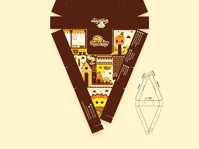
This is the packaging for the crepe. I don't how crepe packaging in your country, but this is typical structure in Indonesia. I don't try to make a new shape, I think this shape is the most ergonomic shape for crepe packaging. The new point in here, is the illustration on top of it.
Most of the crepe packaging in Indonesia is so bored. They just put the logo and some background. I don't think it's bad design, but just... there is no difference. We can make something new from that point. I analyze another food enterprise in Indonesia. I see they use illustration in their plastic cup. It looks fresh and enjoyable rather than just a plain package box. Then I apply it to my design.
You can see some design element from the card name here. I try to make every visual assets related one each other. You can see same visual style and element there.
For additional, I put several information on the box. There are contact and the flavor list there. Well, it's typical information that you put on your food packaging I guess. The flavor list also have check box, so you don't have to open the box to know what crepes is inside
