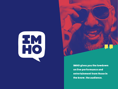
IMHO Branding Direction
Further versions of the branding direction created for In My Honest Opinion, a new platform for people to review and rate live performance in Brisbane. With a grand, fun, tongue in cheek brand voice I worked with a suite of bold colours to feature throughout the site. Duotone gradients on key imagery kept the brand voice loud, with the usage of sharp cornered edges (reflective of the chat icon) and bold type.
More by Jade Stephens View profile
Like
