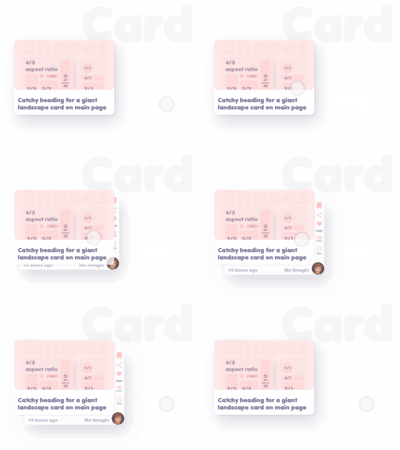
Card layout — Design system basics #3
This is the second shot from the series of "Basics" — in which I turn exploration of creating simple design system into something visually engaging. Typography is still on a rudimentary level, and icons might use some work too but I hope I'll improve these aspects in future shots. #4 is typography perhaps? If you have any feedback on this topic, be free to leave it here. Have a nice day!
More by lalacode View profile
Like
