Team Bedgood Logo Identity


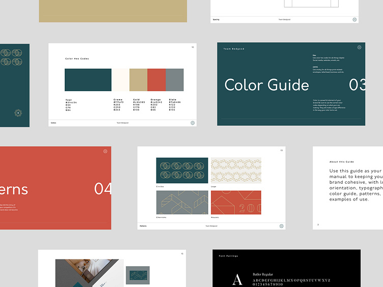

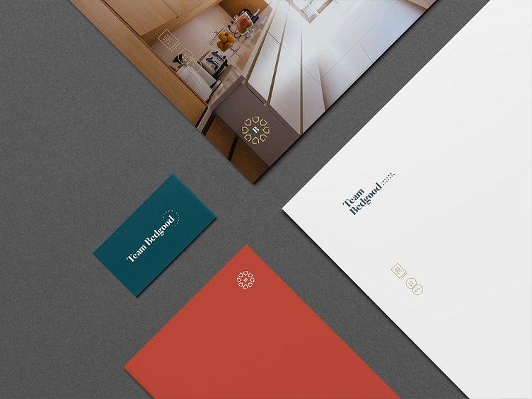

Case study coming real soon! I plan on using this as an example on my site of how I work with process. I'll post it here when it's ready. This is the logo William Bedgood officially went with. Here's an excerpt about this logo option.
The classic symbol of a house lives within the shape of the logo. It draws back to the idea of support. These shapes are all pointing towards the b in the center showing that you are guiding them into finding their perfect home.
The B in the center. The thicks and thins of the font remind the viewer of classic / traditions. It’s a very personable/ friendly font.
The houses coming together form a perfect star shape in the negative space of the mark. A star is a symbol of a navigation or a guiding light.
