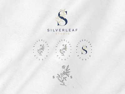
Silverleaf Studio
The client wanted something very elegant with a hand-drawn floral element to it. A logo that can be used on various mediums. I used the “S” as a basis and illustrated a floral to go with it. That way it can be used as a logo mark. The client liked the idea of having dots added to the logo and I illustrated this subtly into the logo, giving it a somewhat magical fairy dust-like approach.
The logo represents the beauty and “magic” of the creative and artistic process of the client as she launches a craft blog containing tutorials as well as stories about her own crafting experiences.
More by Bronwyn Pomuser View profile
Like

