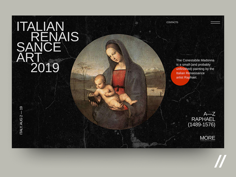
Italian Renaissance art 2019 Web Interface
We keep searching for new ways to enhance the experience of art lovers. Another design concept for an exhibition promo page is already here! Main considerations:
🌑 We used pure black to focus visitors primarily on art pieces and keep the layout clean and simple.
🎭 The background image is an actual artwork. The users can pore over art and get general information before even visiting the event.
📌 This page helps to easily keep track of exhibitions. Users can simply look at the calendar to check the variety of upcoming events.
This is just an experiment but still… would, you think, a page, like this one, help museums and galleries attract more visitors?
Catch art vibes and Press ❤️ if you like the concept!
Created by Ilya Sablin
The team is available for new projects! Drop us a line: hello@purrweb.com | WhatsApp
We share experience in designing interfaces for healthcare startups 🏥, give insights into developing an app for pet owners 🐈, and reveal the secrets of coming up with a competitor to famous services 🤩
Keep in touch and check out our recent news 💜
Join us on: Website | Instagram | Medium | Behance | Facebook
