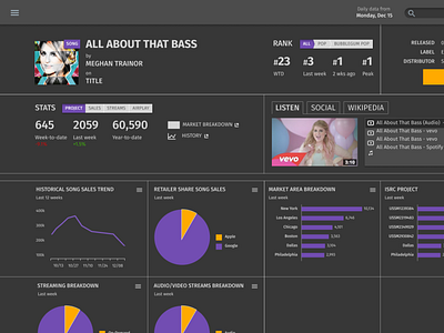
Dark UI Practice
Designing dark themed interfaces has previously challenged me, but I'm starting to think they're fun. Every color decision becomes more important because any errant splash of color could draw the user's attention away from what's important. This UI is pretty data heavy, so using color in a focused and intentional way can make that data easier to interpret. (I worked on this as part of Erik Kennedy's LearnUI.design course).
More by Codey Albers View profile
Like
