Welcome to the Dark Side 🌒


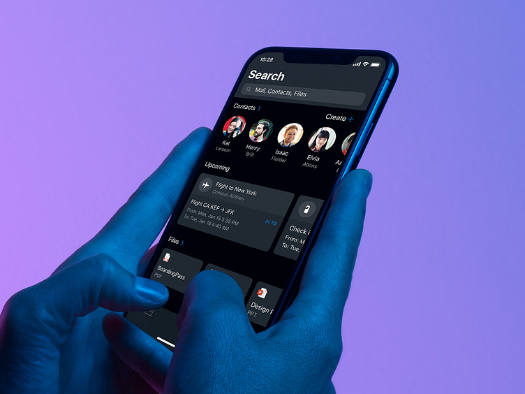


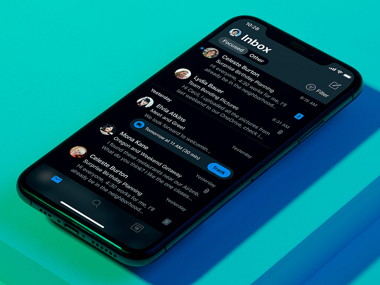

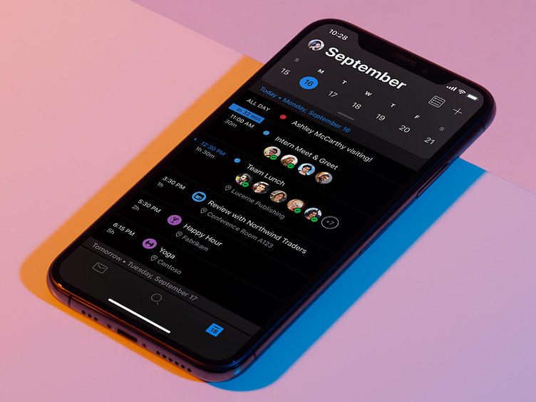


We’re excited to release dark mode on Outlook for iOS and Android. We’ve carefully combed through the details and surface colors in the app to make sure your eyes can adapt to your email, on your terms, without sacrificing quality. We’ve paid special care to accessibility, eye strain, elevations, surface colors, and battery life — while drawing inspiration from films, art exhibits, and city nights. This was a huge effort from across Microsoft to align as one across our entire product suite – a big thanks to everyone involved.
It’s rolling out today on the Google Play Store and Apple App Store. We hope you like it.
—
Thanks to Joe Woodward, Claire Anderson, Will Hou, Daohan Chong, Lance Wang, Luna Zheng, Bei Li, Lency Qian, Summer Li, Ting Zhang, Charles Riccardi.
Special thanks to Miles Fitzgerald, Corbin Reynolds, Michael Palermiti, Tali Roth, for making space for the team. This was a huge effort across Microsoft with countless names to list.
Check out "Designing Dark Mode" on the Microsoft Design blog