UI Kit | Color contrast analysis
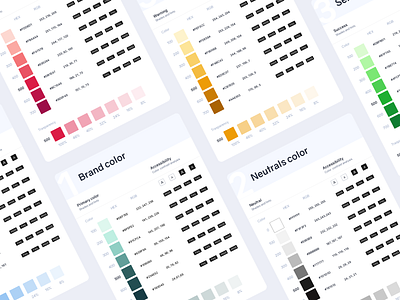
I had been working on the color palette where I did the accessibility test for each color. The contrast ratio of at least 4.5:1 for small text against its background and at least 3:1 for large text, to make it more readable and legible.