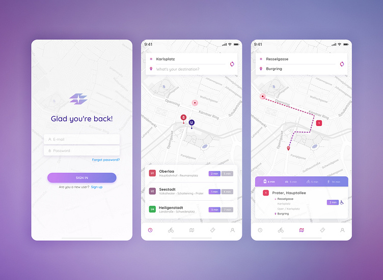
Vienna mobility app / redesign concept #1
Hello, Dribbblers! Inspired by one of the UI Daily Challenges, I've started to redesign one of the apps I use everyday in Vienna (Wien Mobil). It's a great solution if you're in a hurry and it also offers you alternatives to the public transport - like car and bike sharing, taxi or rent-a-car. It has schedules, real time alerts, online tickets... overall it's all you need, but its UX needs some improvement. I've started with some paperwork for prototyping, comparing at the same time the old screen and my version. Now I'm trying to organize styles and UI elements, so I can be consistent during the entire redesigning process. For this preview I recreated a few screens, mostly because I want to define a styleguide (and also to post a nice dribbble shot).
So I'll be back with rebounds :)
