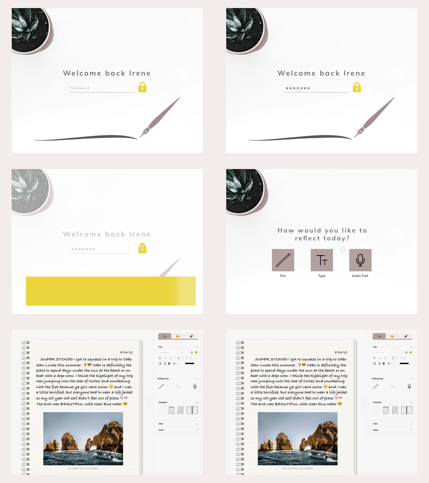
Documenting Diary Concept
As someone who likes journaling and documenting life experiences, I wanted to create the perfect diary (I designed for myself here and aware that this should be avoided IRL)
As I was designing this I realized I was subconsciously drawing from different competitors by incorporating features from apps such as OneNote and Evernote (ie: drawing tool, template options, attachment features…etc) and Procreate as a potential indirect competitor because of the stylus tool feature, and the ability to easily delete, correct and create/document content while recreating the familiar experience of pen on paper.
I was going for a personal feel represented by the greeting, lock, writing options and in-text personalization.
With the proper user research, conducting user testing with a similar prototype would be key to uncover information about the placement of content, features and verbiage from the UX perspective, and the tone and feel of the design including color, illustration and UI elements to improve user value and develop a branding system.
I was also attempting to improve my animation skills using Principle!
