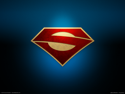
Superman Logo
If Superman’s logo is an alien symbol, shouldn't it look a little more alien? The idea was to keep the iconic diamond shape of Superman’s logo, and fit the “S” into it more completely, taking the decades-long evolution to its natural end. Taken as a whole, this logo speaks to Superman’s alien origins, coming across as a glyph that could be interpreted as an “S,” without being too obvious about it.
Read the full article:
https://medium.com/@DanielBeadle/logoshop-part-3-superman-617d9641dbd8
Download the wallpaper pack:
https://gum.co/supermanwallpapers
More by Daniel Beadle View profile
Like
