CAREER MASTERY Logo Design
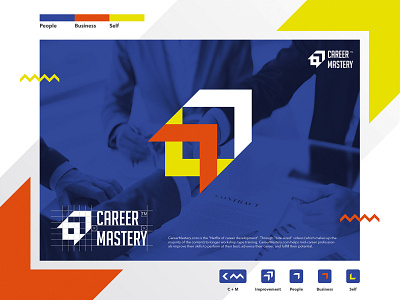
CareerMastery.com is the "Netflix of career development". Through "bite-sized" videos (which makes up the majority of the content) to longer workshop-type training, CareerMastery.com helps mid-career professionals improve their skills to perform at their best, advance their career, and fulfill their potential. Their target audience works in professional services firms such as banking, law, accounting, consulting, etc. They range in age from 30s to 50s, 70% are female and 30% are male, and the majority are based in the US.
The logo formed from 2 elements, they are icon and wordmark. I can't off from 3 values (people, businsess, and self) it why consist of 3 shapes, 3 colors, improvement (skill) icon, and CM inicial. Each one represents 3 values. Blue color which mean people, orange represent business and yellow for working with self.
