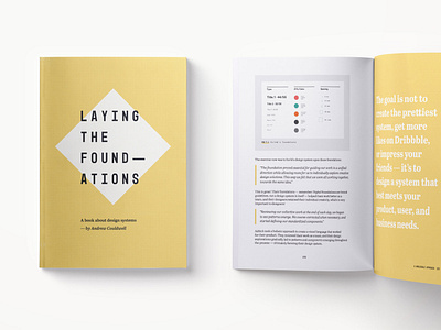
Laying the Foundations book
I wrote a book! I designed it too. This is my first attempt at print design (so go easy on me).
You can purchase the book on the book's website!
The book brand features a simple yellow, black, and white colour scheme. Yellow because of its connections to the construction industry and building sites, which works well with the construction analogies used in the book; relating to building design systems and 'laying the foundations'. There are various shapes featured throughout the book, which are also construction analogies; be it building blocks or the shapes of construction signs. And the monospace typeface I used for the cover and chapter titles is a contemporary play on the font used in construction signage.
More by Andrew Couldwell View profile
Like
