Atlanta Real Estate Logo / Identity
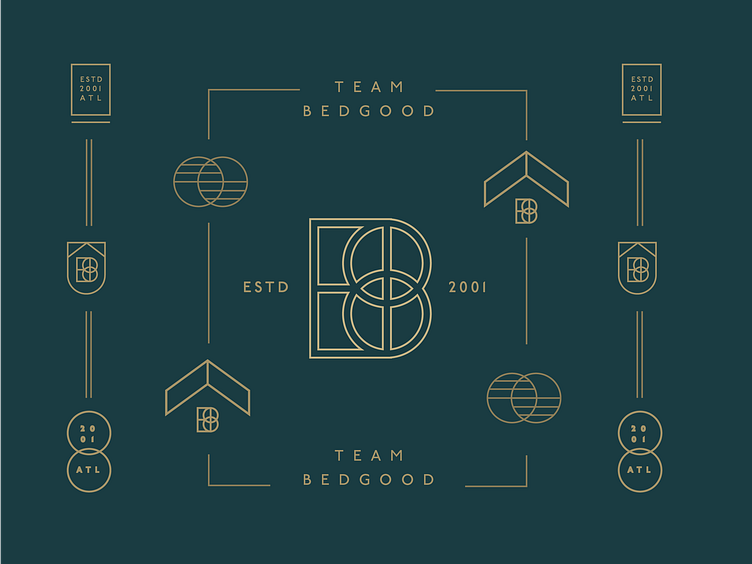
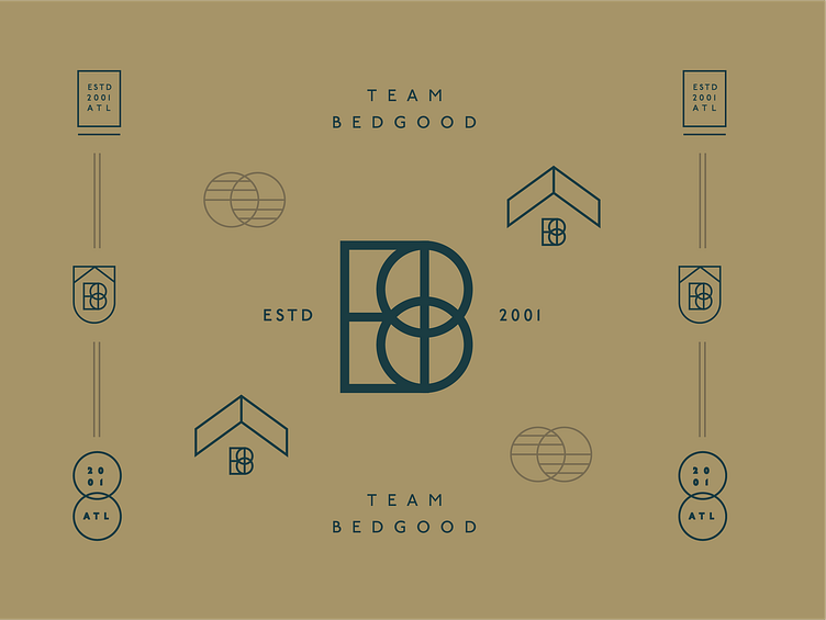
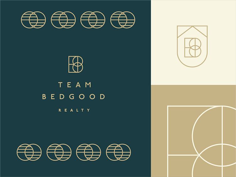
I've been gone for a minute but it's only because I've been so busy with freelance (which is a great thing when you're contract) This is option one of a logo design I was working on for a realty group in Atlanta, GA. I wanted the mark to represent the B of the owner's last name, and have the two circles in the center meet to show the relationships they share with their clients. Other versions were a seal with a roof shape in the center, and the B with that chevron over it. This isn't the mark the client went with, but I had a great time creating this one :)
