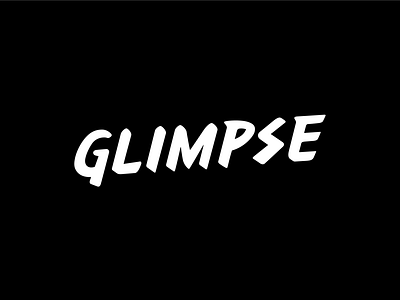
Glimpse Logo
Been staring at this for tooooo long.
I hope the balance looks right here — the logo needs to have a feeling of being hand written, but the strength and balance of a crafted logo-mark.
I'd be keen to know what people think! Does this look right to you?
More by Mike Andrews View profile
Like
